@neodx/svg
Supercharge your SVG icons ⚡️
Modern, type-safe, and lightning-fast SVG sprite management for any frontend stack.
Why @neodx/svg?
- Type-safe icons: Autocomplete and catch typos at build time with generated TypeScript types and metadata.
- Universal integration: Works with Vite, Next.js, Webpack, Rollup, ESBuild, RSPack, Storybook, and Node.js scripts.
- Smart grouping & cache-busting: Group icons into multiple sprites, with automatic hashing for cache safety and efficient updates.
- SVG optimization: SVGO-based minification and cleanup, with sensible defaults and full customizability.
- CSS-driven color control: Manage icon colors from CSS, support dark mode, and theme icons without editing SVGs.
- Multicolored icons: Advanced color strategies for icons with multiple colors and CSS variables.
- Autoscaling, accessible Icon component: Build your own with type safety, correct scaling, and accessibility.
- Automatic cleanup: Remove outdated sprite files with no manual work.
- Integrations & recipes: Out-of-the-box support for Figma, Heroicons, React, Vue, Svelte, Solid, and more.
Quick Start
1. Install
bash
npm install -D @neodx/svgbash
yarn add -D @neodx/svgbash
pnpm add -D @neodx/svg2. From Config to Usage (example for vite + react)
Configure your assets
ts
import { defineConfig } from 'vite';
import react from '@vitejs/plugin-react';
import svg from '@neodx/svg/vite';

export default defineConfig({
  plugins: [
    react(),
    svg({
      // A "root" directory will be used to search for svg files
      inputRoot: 'src/shared/ui/icon/assets',
      // Path to generated sprite/sprites folder
      output: 'public/sprites'
    })
  ]
});
Example generated sprite (public/sprites/sprite.svg)
xml
<svg width="0" height="0">
  <symbol xmlns="http://www.w3.org/2000/svg" id="arrow-drop-down" fill="currentColor" viewBox="0 0 24 24">
    <path fill="none" d="M0 0h24v24H0z"/>
    <path d="m7 10 5 5 5-5z"/>
  </symbol>
  <symbol xmlns="http://www.w3.org/2000/svg" id="arrow-drop-up" fill="currentColor" viewBox="0 0 24 24">
    <path fill="none" d="M0 0h24v24H0z"/>
    <path d="m7 14 5-5 5 5z"/>
  </symbol>
</svg>
Minimal Icon component
TIP
Learn more about Icon component implementing
tsx
import clsx from 'clsx';

export function Icon({ name, className, ...props }) {
  return (
    <svg
      className={clsx('select-none fill-current inline-block text-inherit box-content', className)}
      focusable="false"
      aria-hidden
      {...props}
    >
      <use href={`/sprites/sprite.svg#${name}`} />
    </svg>
  );
}
Use your Icon component
tsx
import { Icon } from './icon';

export function SomeComponent() {
  return (
    <div>
      <Icon name="arrow-drop-down" className="text-2xl" />
      <Icon name="arrow-drop-up" className="text-blue-500" />
    </div>
  );
}
This simple model enables powerful and flexible usage
tsx
import { Icon } from './icon';
export function SomeComponent() {
return (
<div className="flex flex-col gap-4 text-base">
<div>
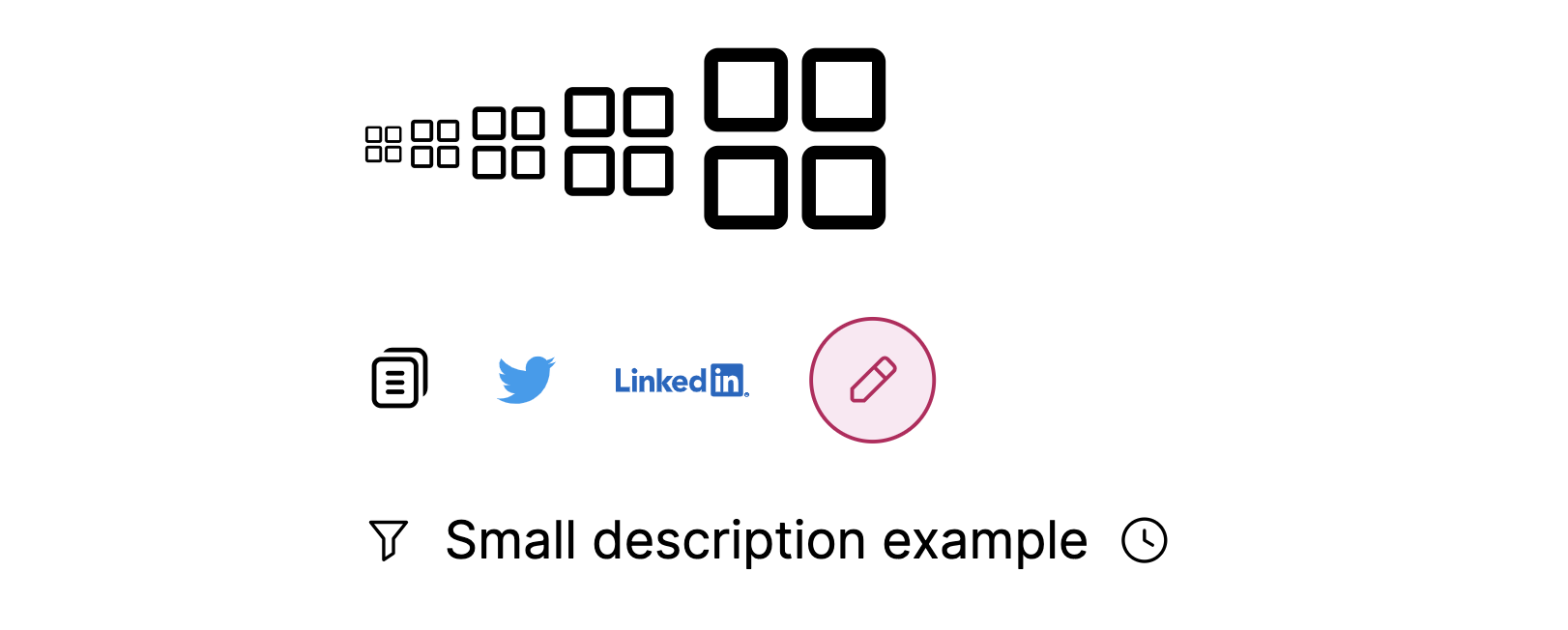
<Icon name="common/groups" className="text-xs" />
<Icon name="common/groups" />
<Icon name="common/groups" className="text-2xl" />
<Icon name="common/groups" className="text-4xl" />
<Icon name="common/groups" className="text-6xl" />
</div>
<div className="flex gap-4 items-center">
<Icon name="common/copy" className="text-xl" />
<Icon name="logos/twitter" />
<Icon name="logos/linkedin" className="text-4xl" />
<Icon
name="common/edit"
className="bg-pink-100 text-pink-700 p-2 rounded-full border border-pink-700"
/>
</div>
<span className="text-sm inline-flex items-center gap-2">
<Icon name="common/filter" />
Small description example
<Icon name="tool/history" />
</span>
</div>
);
}
3. Other setups
Integrations & Recipes
Frameworks & Icon Sources:
Recipes:
Advanced: Node.js Programmatic API
Want full control? Use the Node.js programmatic API:
js
import { createSvgSpriteBuilder } from '@neodx/svg';

const builder = createSvgSpriteBuilder({
  inputRoot: 'src/shared/ui/icon/assets',
  output: 'public/sprites',
  metadata: 'src/shared/ui/icon/sprite.gen.ts',
  group: true
});

await builder.load('**/*.svg');
await builder.build();
More Resources
- Setup guides:
- Integrations:
- Features & API:
- Other:
Enjoy!
If you have questions or want to contribute, check out our GitHub.