Aligning text with icons
Properly aligning SVG icons with text ensures a polished, professional UI. This guide explains the common baseline alignment issue and how to fix it for consistent, visually pleasing results.
TIP
See a live illustration in our Vite + React Example.
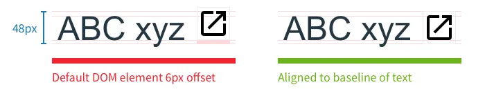
Final Result
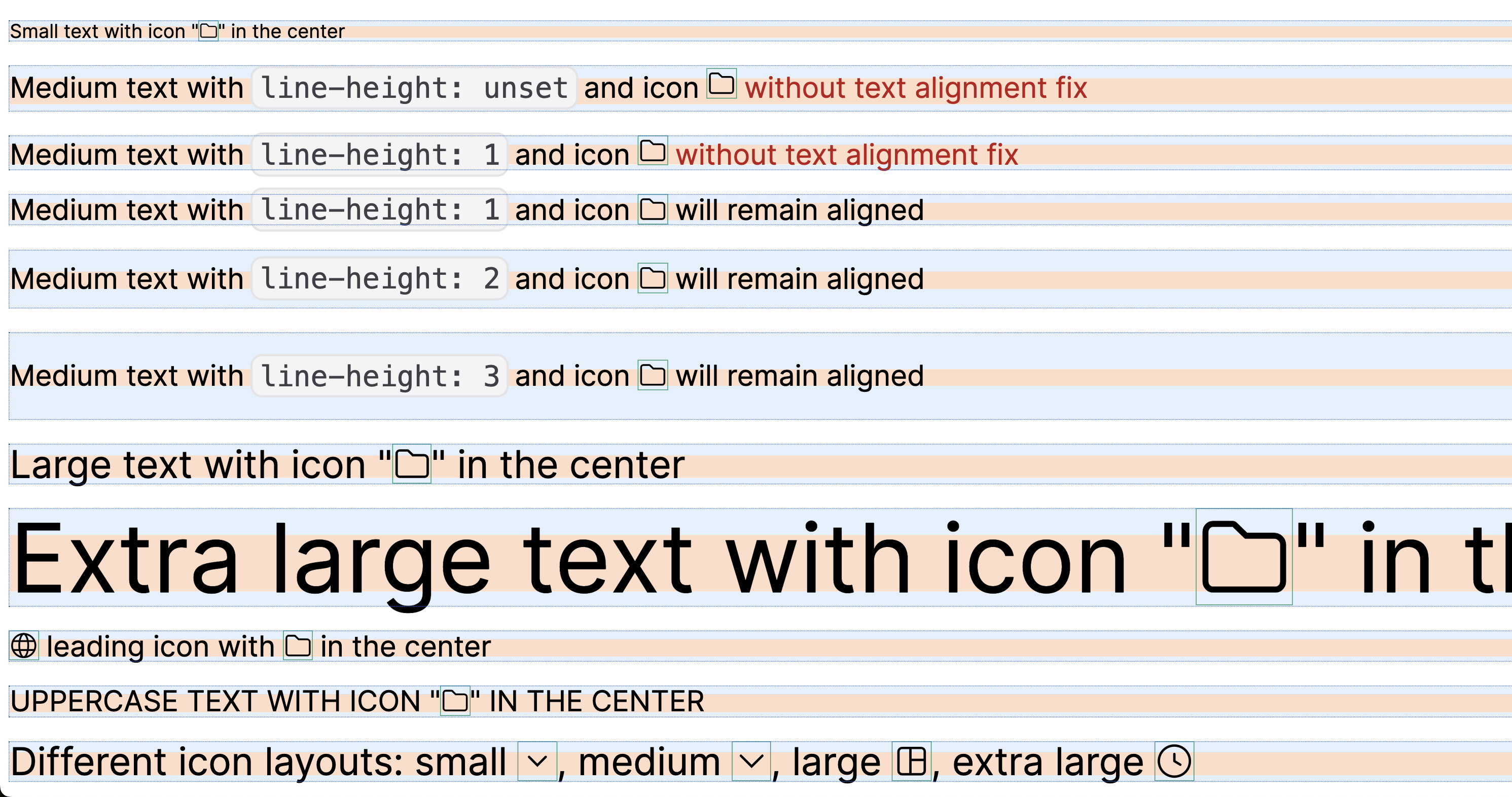 Above: Examples of correct icon alignment in various text scenarios
The Problem
SVG-sprite-based icons are convenient for inline use with text:
- Icon color inherits from
currentColor(see color reset) - Icon size inherits from
font-size(see integration guides)
However, SVG icons often shift the text baseline, causing misalignment:
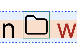 Above: The icon is not visually centered with the text baseline, causing layout issues.
Browsers try to align the icon with the text baseline, but the result is often off, especially with different typefaces.
Why does this happen?
SVG icons are rendered inline with text, but their default alignment box and the way browsers handle SVGs often don't match the font's baseline and metrics. This causes the icon to appear slightly above or below the intended line, leading to visual misalignment.
- SVGs are aligned to the text baseline by default, but their internal viewBox and lack of font metrics can cause them to "float" or "sink" relative to the text.
- The problem is more noticeable with icons of different aspect ratios or when mixing with various font sizes.
Font layout differences
Most typefaces use the "1/8 rule": the font layout has 1/8 offsets from the top and bottom, but not all fonts are the same. This means the ideal alignment offset may vary by font.
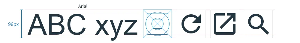 Above: Typical typeface layout with 1/8 offset from top and bottom.
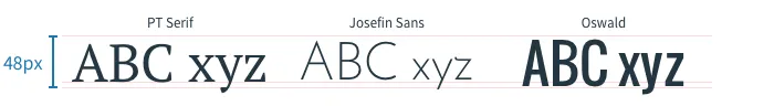 Above: Different typefaces may require different alignment tweaks.
The Solution
To visually center your icon with text, apply a small negative vertical offset:
.icon {
  /* ...other icon styles... */
  vertical-align: -0.125em;
}- This aligns the icon visually with most text baselines.
- For some typefaces, you may need to tweak the value (e.g.,
-0.1emor-0.15em).
 Above: The icon is now visually centered with the text baseline.
Best Practices
- Always test your icons with your project's font(s)
- Use a utility class or extend your icon component to include the alignment fix
- Combine with autoscaling and color reset for best results
- See integration guides for framework-specific tips